This is the first post in the interviews series I decided to conduct with human-computer interaction designers based in different locations around the world, with different nationalities, backgrounds, and careers.
I worked with Leonardo Lanzinger on a new project to aggregate live videos from multiple services in one interface. I worked on the API, and he worked on the client side. We added three services already: Youtube, Twitch and Periscope. Continue reading Reemote: Aggregating Live Videos
I got a chance to work on a project in which I have to figure out, if we didn’t have the current keyboard layout, what would be the best layout?
To determine the best layout, we were given an objective function which, given a layout, gives you the expected words per minute (wpm). The objective function takes into consideration the bi-gram frequencies of letters, and since the assignment was in Finland, it considers bi-gram frequencies of the Finnish language. At this point, the problem turned into an optimization problem.
People like to watch videos. The way videos transfer information beats any other media form (still photos, audio clips). Billions of videos are watched everyday. Can we use those free-watching habits of videos for video annotation and tracking objects in videos? I worked on a research project to try to answer this question.
Have you ever thought of drawing your own interface? Say you have a music player app on your laptop, and you want to draw your own play, stop, next, previous buttons, and access the app from a distance, this is what the project is about.
PaperUI allows you to draw your own interface on paper, map it once, and then use it to control an app on your computer.
We used Leap Motion device, placed on a stand, which is attached to a clipboard. We used both a laser cutter (for wooden stands), and a 3D printer for the Leap Motion holder/cover.
Conversion rate is an essential measure of the performance of any online-based business. Along with churn rate[1], it gives the most accurate indication of a business’ growth. Conversion rates are highly affected by the experience the users have to go through during signing up for a service or a product. Conversion rates are typically around 5%, but for unoptimized-for-conversion experiences, conversion rates drop to a value between 2.5% to 3.1% in online markets[2][3]. I had the chance to work on a conversion rate optimization in a live environment of a subscription-based app in the United States market with ~35,000 paid customers (paying $49 to $69 per month).
Sometimes, sophisticated movies that get nominated and wins Academy awards are not generally well perceived by the public. Some people also say that the Oscars are very political, and that they are forged or manipulated to benefit a group of people, and they are not really awarded for performance. This hypotheses is always backed up with saying that general and critiques rating do not usually align with the awards.
I was assigned a small task as part of an InfoVis project to find out: Do public ratings of movies match academy awards?
Animation has proven to be a major attention-grabber for users. Whether it is transition animation, or same-state animation, UI designers are always trying to utilize it. A thing to consider during animation or visualization is preattentive features. Preattentive features are those aspects of a visual presentation that our iconic memory picks up, like color, size, orientation, and placement on page. In other words, they are any attribute “which is processed in spatial memory without our conscious action. In essence it takes less than 500 milliseconds for the eye and the brain to process a preattentive property of any image”[1]. I had a chance to work on a project where we had to evaluate some visual animations/attributes to check if they are preattentive or not. Continue reading Experimenting with Preattentive Visual Variables
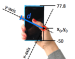
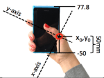
A common challenge that we all face, especially with the trend of making bigger phones, is reaching widgets far away from our thumbs reach, on our phones screens while holding them. Designers try to optimize that by placing most frequently accessed buttons in the most comfortable reach for the thumb (by using heat maps from test sessions or from live products). A recent paper proposes a model for calculating the thumb functional area[1]. By giving the algorithm four values, it calculates the area and plots it. The four values are:
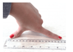
Finger Span or Hand size (s): the distance between the thumb and index finger as shown in the figure
Index-finger distance (d): the distance of the index fingertip from the point of intersection of the hand with the phone
I was recently assigned a task – as part of my graduate studies – to analyze the clutter in colors in any interface. It was sort of a freestyle task: everyone should come up with his own approach. I chose to analyze the color feature congestion in the feature space[1]. The analysis follows the dominant color approach, in which a score is given for the variability in colors in images. Based on that, each image is given a score. The higher the score, the more the image is congested. Lower score means the dominant colors are close to each others, which implies that the feature space is not congested, i.e. uncluttered. Continue reading Analyzing Clutter in Color