I was recently assigned a task – as part of my graduate studies – to analyze the clutter in colors in any interface. It was sort of a freestyle task: everyone should come up with his own approach. I chose to analyze the color feature congestion in the feature space[1]. The analysis follows the dominant color approach, in which a score is given for the variability in colors in images. Based on that, each image is given a score. The higher the score, the more the image is congested. Lower score means the dominant colors are close to each others, which implies that the feature space is not congested, i.e. uncluttered.
The score is calculated as follows:
Get k most dominant colors in image using k-means clustering
Transform color to L*a*b space[2]
Get the differences between the colors
The clutter score is the average difference between the colors
I was able to analyze and validate the performance of this metric using a couple of web interfaces (and one random image).
1. Mashable Interface
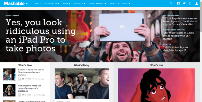
Score=94.4
2. Soundcloud Interface
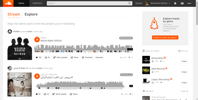
Score=57.8
3. Simple Interface
Score=50.8
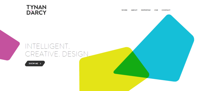
4. Flat Design Website
 Score=76.2
5. Twitter Interface
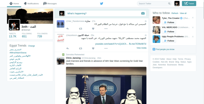
Score=80.4
6. Facebook
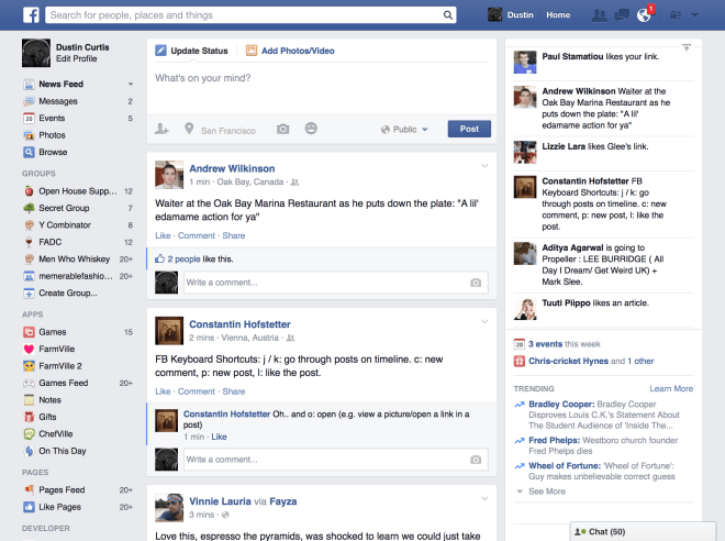
Score=60.3
6. An obviously Cluttered Interface
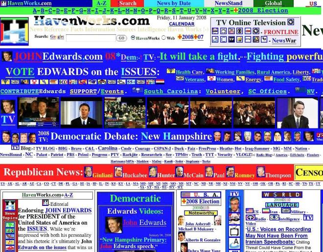
Score=83.4
7. Youtube Interface

Score=76.2
8. Gmail
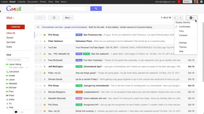
Score=54.8
9. Dropbox
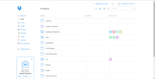
Score=31.7
10. Portfolio 1

Score=53.5
11. Portfolio 2
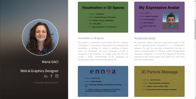
Score=75.8
BONUS: A Random Image

Score=75.6
A final note: this score indicates the clutter in the color space, which does not necessarily mean that your interface is bad; how you utilize this clutter is what makes your interface a good or a bad one (compare #1 to #11 in examples).
[1] Rosenholtz, Ruth, et al. “Feature congestion: a measure of display clutter.”Proceedings of the SIGCHI conference on Human factors in computing systems. ACM, 2005.
[2] Identifying Color Differences Using L*a*b* or L*C*H* Coordinates
